DataViz_Project2
Data Visualization Crituque by Design
Section 1: Background (what & why this visualization):
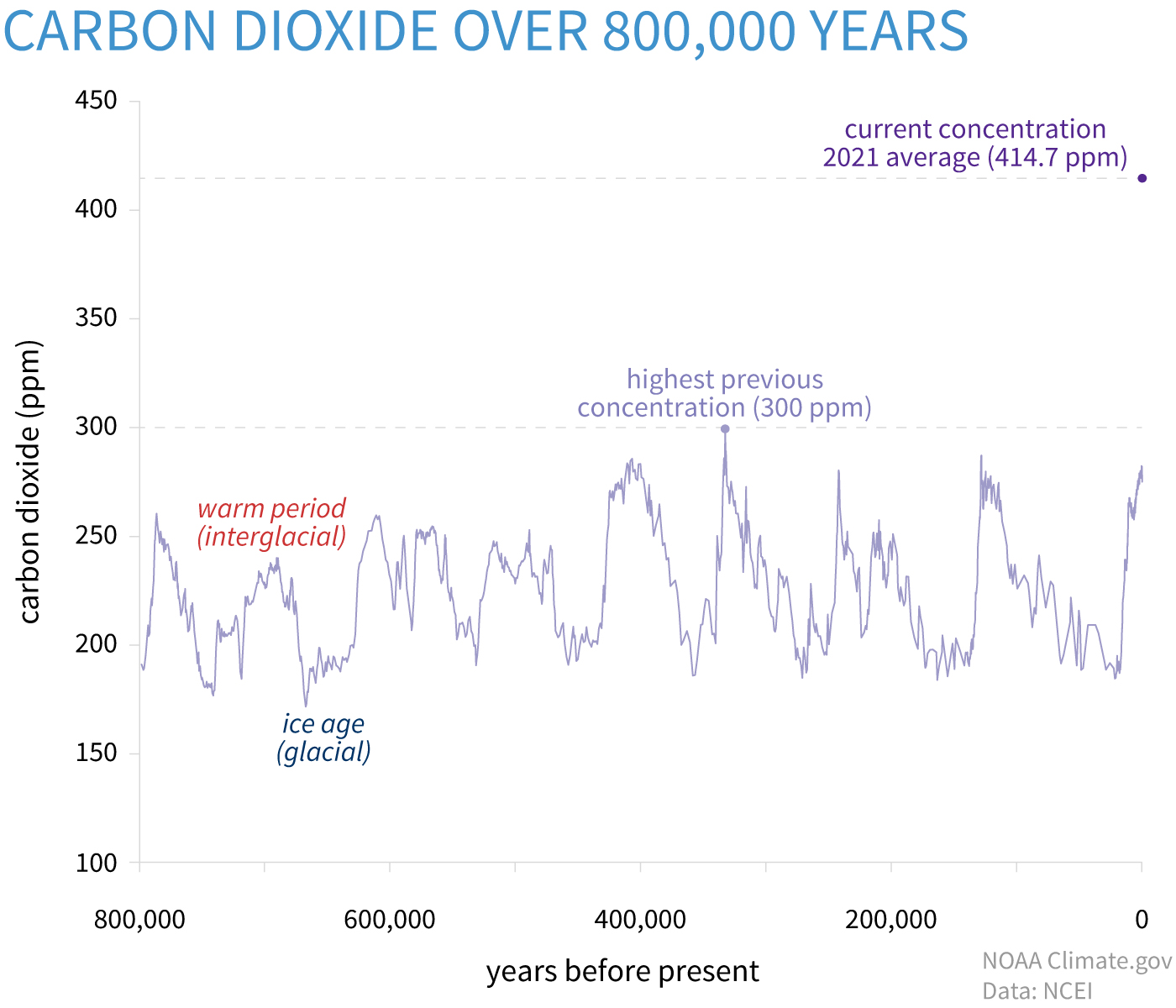
This visualization is found at climate.gov. It is used in the article Climate Change: Atmospheric Carbon Dioxide to illustrate that the carbon dioxide level had reached a level that had never beeen attained over the past 800,000 years.
 I am interested in this visualization because of a news about Kylie Jenner’s “climate criminal” After Her Private Jet Was Exposed For Taking Super-Short Flights two months ago. The Original news Article is from BuzzFeed News. Quoted from the news, “private jets have been found to emit two tons of CO2 in just one hour”. Therefore, I believe it’s important to alarm people who co2 is increased to a incredible level and call on action to elimate carbon print in our daily lives. In this regard, the visualization need to meet two primary requirement: 1. easy to understand by layman, 2. impress the audience to really take actions.
Section 2: Critiques
Overall obeservations about this data visualization:
- Stood out to me: the first information I caught is that the line chart shows that the number fluctuated a lot within a specific range over time. Then I was attracted by the text saying “highest previous concentration”.
- What I found worked well: the four text explanations on the graph help the audience to better understand the data as they provide the specific events explaining the level of CO2 at the specific time.
- What didn’t work well: based on the topic of the article and its surrounding explanation, the main goal of this visualization is to show how current concentration is much higher than any historical level. However, the point of current concentration on the chart doesn’t stand out, neither by color nor size. Moreover, the point is not connected to the trend line, leaving it unclear about whether 2021 is a spike or it had been a problem for years. Therefore, important information is missing from this visualization as well.
- What I will do differently: As I just mentioned, I would like to make the line continuous, meaning eliminating the gap between the current concentration point and other data shown in the line. That would answer the question raised above. More importantly, I would use a more eye-catching color (dark red, for example) for the current concentration 2021 average.
Define the audience of the visualization and evaluate the effectiveness accordingly
The audience of this graph, in my opinion, is the general populations including a wide range of demographic group with the purpose of drawing attention on climate change related to carbon dioxide emissions. More specifically, its purpose is to show how (sadly) surprising the current global CO2 level is compared to historical records. Although the chart is easily interpretable by general public (meaning there isn’t much unfamiliar/unclear information provided), this visualization is not effective in terms of conveying its main idea as the “current concentration” is not the striking point (even worser, people could easily miss that point with a fast reading).
Comments on Stephen Few’s Data Visualization Effectiveness Profile
Overall, this method helps me effectively identify the problems/area of improvement of the visualization by thinking through each of the metrics. For example, I didn’t really there is a problem with missing data until I thought about the rating for completeness. If there is anything (metric) I would add to this evaluation method, I would add a metric to evaluate if the same main idea could be perceived by different demographics when they look at the visualization. I think this metric is important, especially to this visualization, because too many highlighting (eye-catching) points on a visualization could be interpreted differently based on area of interest/familiarity. For example, people who are interested in history might be attracted by “ice age” noted on the graph rather than climate change, which definitely is not the purpose of this visualization.
Section 3: Sketch out a better Visualization
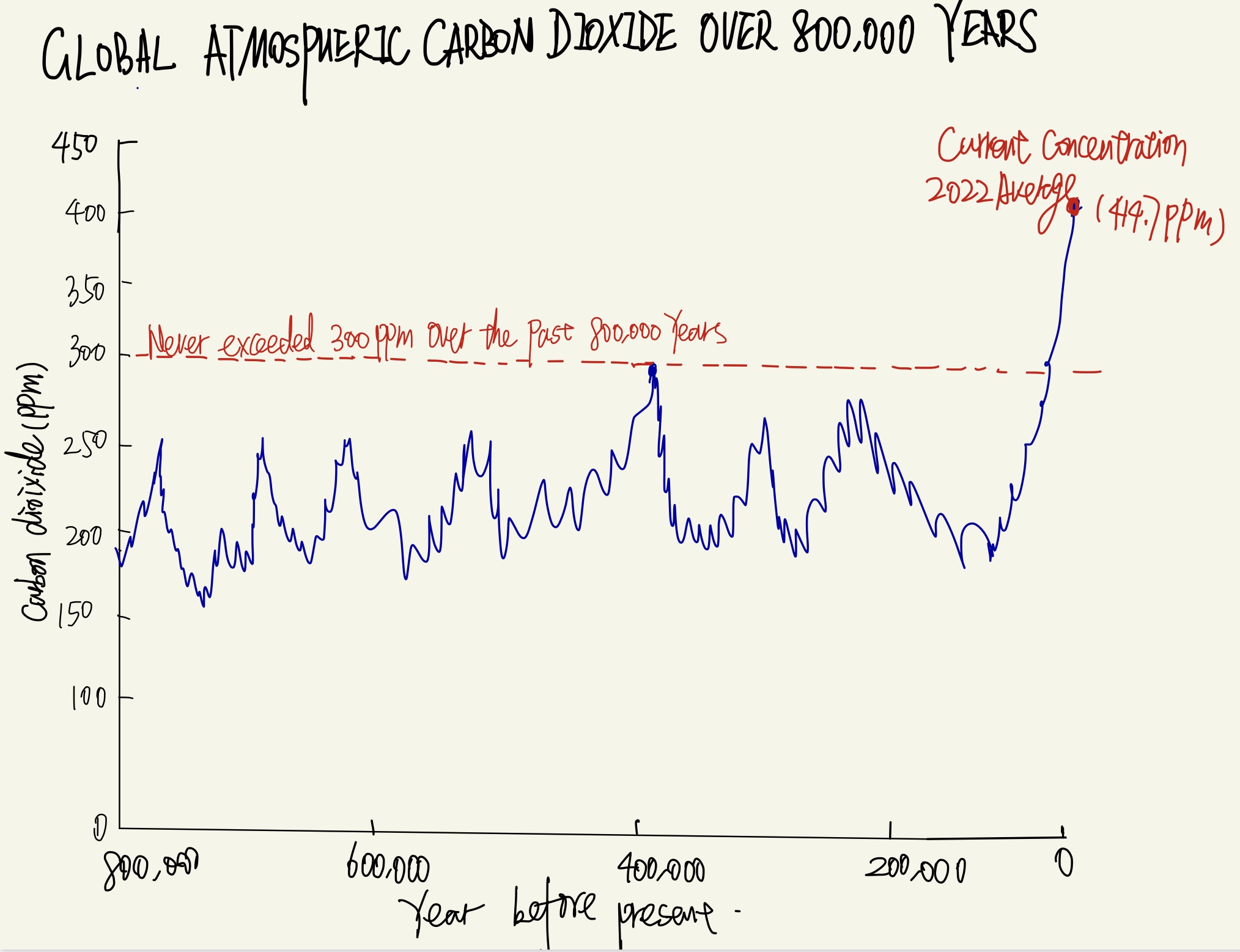
 For the sketch of the redesign of the chart, here are several main modifications I made:
- connect the data from historical records to the current concentration level (which is a single data point on the original data). I aimed at finding the credible data for the years in-between to make the graph be a single trend line.
- Delete the text boxs of “warm period (interglacial)” and “ice age(glacial)” since they are not the main purposed of this visualization (eventually it’s good to know), but they are drawing overwhelming attention and distracting audience from the dramatic increase from the past to current level.
- change the text on the graph to red to draw attention
- Adding a trend line of the highest historical value to make obvious contrast to the current concentration figure.
Section 4: Test the solution (feedbacks from potential audiences)
Interviewee 1: student (who is also taking telling stories with data) , mid 20’s Question: what caught your eye in 10 seconds? Answer: the current level, eventhough I haven’t figure out what is the graph about, I noticed that the current level is insanely high Question: So are you also saying that the subject of the graph is not obvious enough for fast reader? Answer: yes, kind of. Probably due to your hand-written (lol). Also probably the header/title is not informative. Question: what do you think the main audience that is targeted by this visualization? Answer: I guess it would be someone who is interested in climate change and has a some background on carbon dioxide concentrations.
Interviewee 2: no speicific background on environmental science, mid 40’s Question: Can you understand this graph in 30 seconds? Answer: Yes, I think I get the general idea. It shows the carbon dioxide level for the past 800,000 years, as the title says. Question: So based on this percpetion, what is your takeaway from this graph? Answer: there is some fluatuation in the past, and right now the number is much higher than in the past. That surprised me. I know people are talking about carbon dioxide emission all the time but it’s my first time knowing how significant it increased from the past, if I understand correctly. Question: Did you find any part of this graph unclear? Answer: Well I think the bottom where it says “years from the present” (which the interviewee means the x-axis) is hard to understand at the beginning.
Reflection on feedbacks:
Overall, I think the scratch of the solution can deliver the main idea to the general public (which is also the targeted audience). Based on the feedbacks, here are some areas of improvement:
- the title of the graph is not informative enough to provide additional information
- should be more clear and neat to make it acessible to all people as the purpose of this visualization is to impress the audience and call for actions
- the x-axis is kind of confusion to layman
- improve hand-writing (outside of the scope of this course)
Section 5:
For building the redesign solution, I used Tableau.
Efforts on this visualization:
- In order to modify the visualization to be a continuous trend line (rather than a line and a stand-alone point on the original visualization), I gathered multiple data sources for the carbon dioxide level from 1959-2022.
- modify the color of the line (aiming to elinimate the total number of colors used on the visualization to decrease eye-travel)
- Based on the test on the solution, the title is changing to a conclusive, informative sentences rather than simply describing what the chart is about
- Changes on both x- and y-axis title to make it easier to understand by someone has little background on the topic.
Identified Area of Improvement:
- for the x-tick, I think it would be better to add the year number of current year like 2022 to emphasize it’s the current level. However, I don’t think it’s feasible on tableau.