data-visualization-portfolio
Final Project : Part 1
Section 1: Outline of the Project
Summary
The nutrition intake outlook of people in the U.S. : the trend overtime, the demographic difference and distribution in terms of dietary preference, the evaluation on the popular typical American daily meals, and the corresponding obesity rate. The main purpose of this project is to convince people the importance of eatting healthy and provide actionable recommendations through stories and data viusalizations.
Project Structure
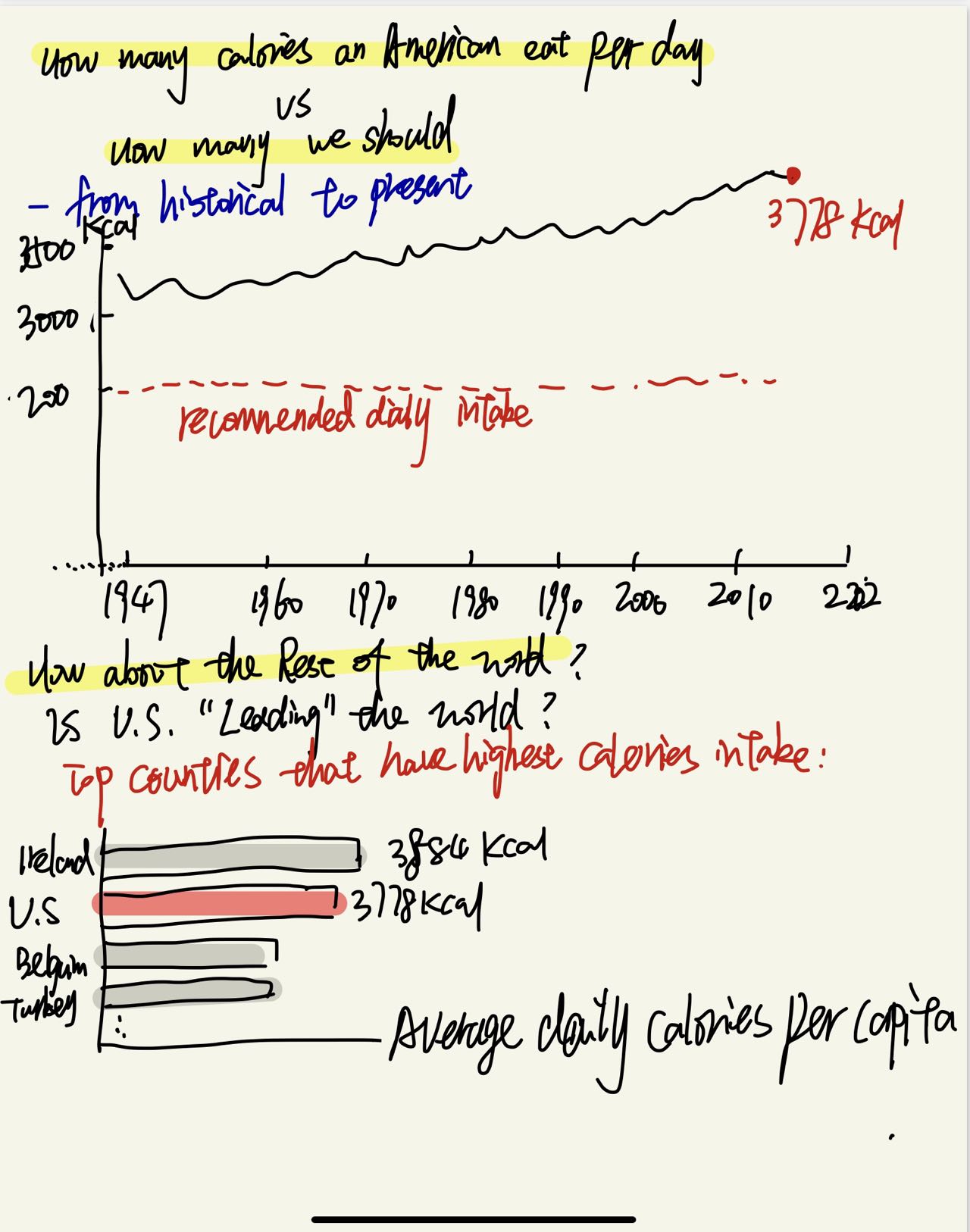
- I would start the story with the visualization of the comparison between the mean daily Calories intake of American and the Calories intake recommended by FDA (broken down by Macronutrients (Carbohydrates, fat, and protein). I assume that would keep the audience’s interest to continue read the article as they will be curious about the details.
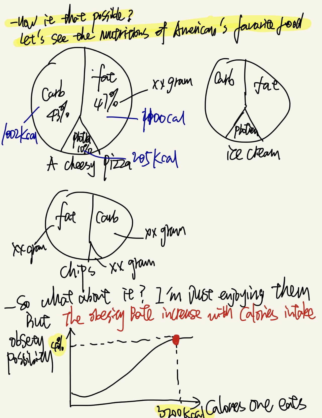
- Then I would list out the most popular foods in the U.S. (breakdown by categories including regular meals, snacks, and sweets, etc) with their calories/nutrition highlights.
- So far I’ve been focused on the nutrients related to the food, then I will move the “People” side of the story: how the nutrition outlook is according to demographic partitions (gender, age, geographic/state, salary level), which I will draw some meaningful conclusions on who are the people that should be cared about more about their dietary intake, and then deep dive into several important factors.
- The deep dive would include: proverty related to obesity, unhealthy dietary preference of teenagers that lead to some concerns on obesity and diabetes.
- In the end, I would provide recommendations on dietary guidelines, and call on public policy makers’ action as well.
Section 2: Initial Sketches
Adding to the initial sketches regarding recommendations & conclusions (inspired from the Critique’s feedback):
- To policy maker/ school administration: modify public school menu to provide more nutritional school meals.
- To resturants/ food providers: also provide nutrition facts and calories information (preferably available before people make orders).
Section 3 Data, use of Data, and Data Source:
- Nutrition, Physical Activity, and Obesity - Behavioral Risk Factor Surveillance System by CDC This data source is found on CDC official website. It provide data on nutrition, physical acitivity and obesity related data for a behavorial risk factor surveillance system on individual level. It aslo has the geogrpahic data (latitude and longtitude which is great for map visualization using Tableau)
- It will be used for:
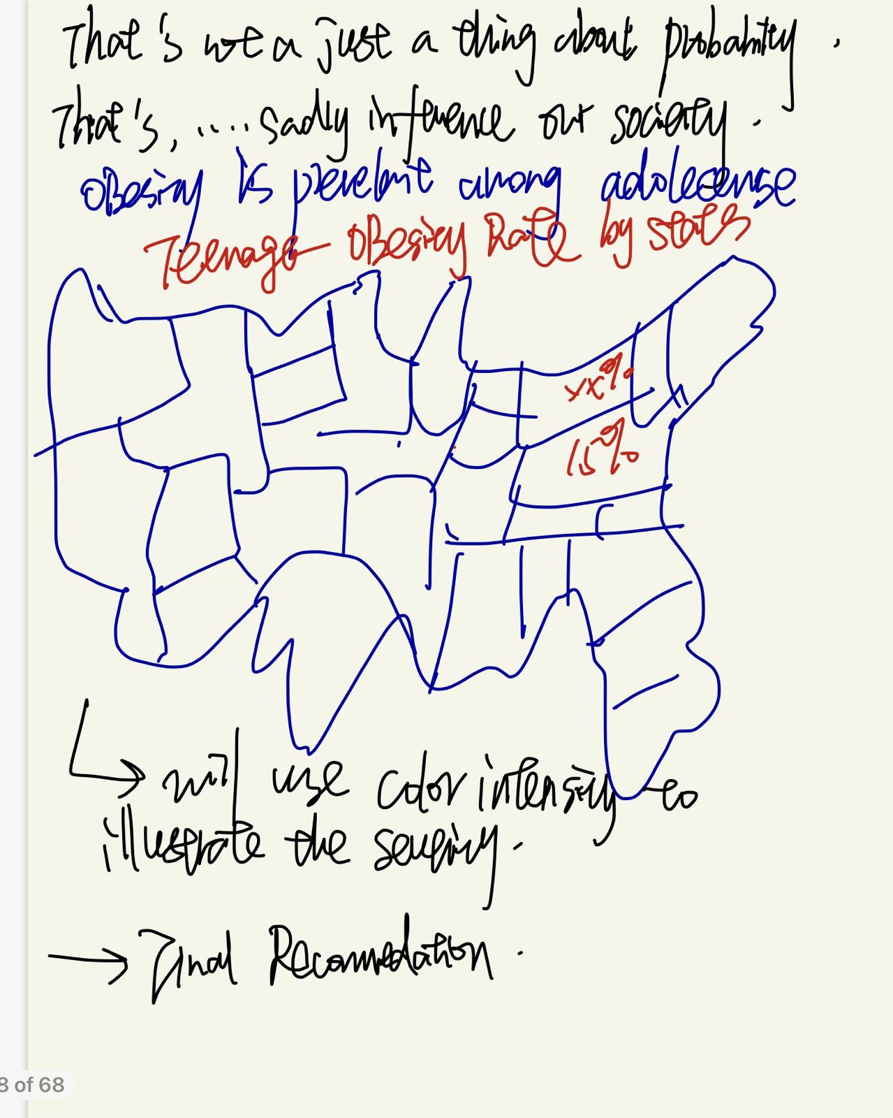
- A Map showing the obesity rate among teenagers for each states (colored map)
- A bar graph showing Obesity rate per age group
- And more to come up given the quantity of features included in the dataset
- NOTE: Tableau Table calculations are expected to realize the desired visualziation!
- Daily supply of calories per person, 1947 to 2018
That dataset is found on ourworldindata.org. It includes the daily supply of calories per person for each countries from 1948 to 2018.
- It will be used for:
- line (trend) chart showing daily supply of calories per person overtime
- bar chart showing the top countries having the highest calories supply based on 2018 data
- AND more to come up…
- NOTE: this dataset is publicly available and the website provides the visualization features that could be used to give trials on different Viz.
- Most ordered food items in the United States 2021, by growth in popularity from Statista
- This data from statista (although it’s not a dataset) would be used to domonstrate the top favorite food in the U.S. (based on the growth) and will be used to join with food calories dataset in order to visulize the nutrition facts of those American’s most ordered foods.
The datasets are uploaded to the data folder in this reposiotry: data-visaulization-portfolio/Data
Section 4: Method and Medium
- For creating data visualization:
- Data Preprocessing: I would use Python for data preparation if needed as tableau’s table calculation has some limitations in several cases
- Data visualization: Tableau as the main tool
- For telling the story:
- I would use shorthand as recommended and create a blog as the dominant medium for this project. At this point, I don’t see neccesity to use other medium, but would update on this page once being identified.
Other Feedbacks from In-class Critique (Action pending)
- Questions came up:
- i. What would be the state level data? Since focusing on the whole U.S. iS too wide, probably would be better to show the states have highest obesity rate (Top 3). Solution: investigate on state level obesity rate (top 5 and pennsylvania speicifically) and show as highlight on the map (data source already identified)
- New Inspiration arose:
- i. investigate the relationship between income group and obesity rate —really good point from a public policy perspective. – ii. investigate the calories burned by exercises/physical acitvites — could be added to the recommendations.